Papik's Challenge
Overview
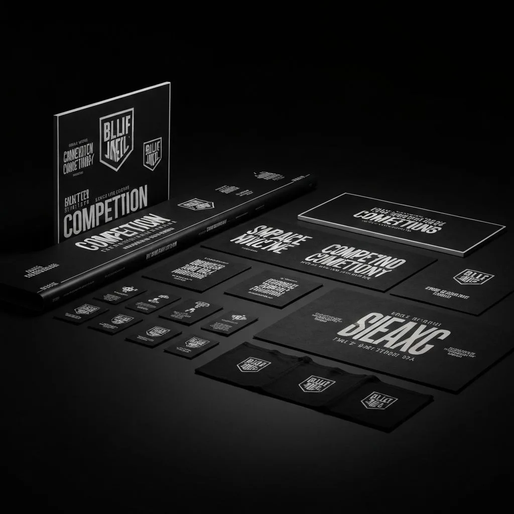
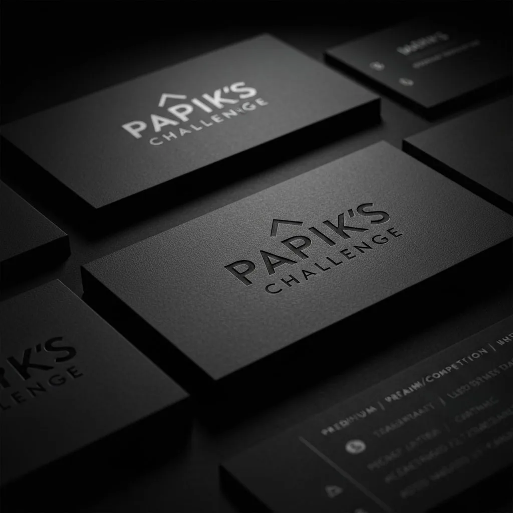
Papik's Challenge needed a brand identity that matched the intensity and excitement of their competition events. We built a complete identity system from scratch -- logo, typography hierarchy, color palette, and comprehensive brand guidelines -- designed to feel bold, energetic, and unmistakably theirs.
The Challenge
The brand had no existing visual identity and needed to stand out in a crowded competition space. The identity had to work across digital, print, signage, and merchandise while maintaining a consistent, high-energy presence.
Our Approach
We started with a discovery session to understand the brand's personality and audience. From there, we developed multiple logo concepts, tested them across applications, and refined the winning direction into a full brand system with detailed usage guidelines.
Project Gallery